

Request to change bottom menu icons
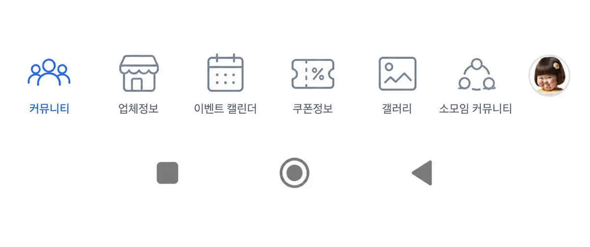
I'd like to request a change to the icons for Community, Business Info, and Meetup Groups. They seem a bit mismatched, and I'd appreciate it if they were updated so you can tell what they represent just by looking at them.
6/6, 22:33 resolved— 40 coins awarded to author
좋은 아이디어 감사
21

Comments 8
Given that the target age group for future influx is likely to be relatively older, it would be best to use expressions that are easy to see and understand.
Haha, that's great! How about this for the community icon? This looks like a bulletin board. I think it would be good to make this a sub-community.
Let's put this to a vote. ㅡ.ㅡ No matter how I think about it, just having three people doesn't make it a community...
Is it just the three of them and absolutely no one else? Is this really it, just the three of them currently? Not even any ghost members?
My icon pack doesn't have any with 3 or more people, so I made one myself, but it turned out looking like bean sprouts.
I thought it was bean sprouts... but why is there such a gap between the head and the body?! Please fix it.
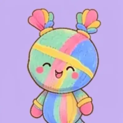
How about this? (Source: ChatGPT request)
It's great because it's intuitive.
Please log into write a comment.